Focus Feature: Beavertown – Tempus Project Applelation, Best Individual Design 2017
Our ‘Focus Features’ aim to shine a light on the previous winners of SIBA’s Business Awards in the run up to the launch of the 2018 SIBA Business & Industry Awards on 1st November 2017.
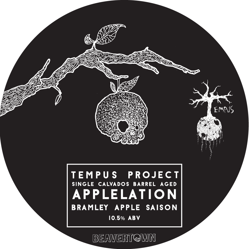
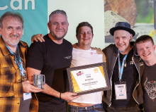
Beavertown – Tempus Project Applelation
Best Individual Design 2017
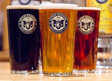
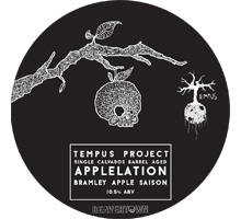
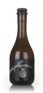
Judges were wowed by the subtle simplicity of Beavertown’s Tempus Project Applelation design, which combined Beavertown’s unique hand-drawn style with an almost gothic twist on this special edition beer.
Judges were unanimous in their praise of this design and felt it really stood out as a standalone piece of brewing artwork.

Saxon Packaging, who produced the concept packaging for the Beavertown Tempus Project beers, talk us through the design process,
In November 2015 we Saxon Packaging were asked by Beavertown to design a new bespoke gift pack for their premium bottled beer Dr. Jekyll & Mr. Hyde.
“The beer we produce is to the highest standard we could possibly achieve; we give it our all. We’ve always approached our branding and design the same way, attempting to keep it on par with our beer so we wanted a gift pack that reflected this” said Nick, Creative Director of Beavertown Brewery.
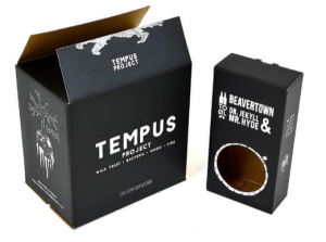 The challenge for us, at Saxon Packaging, was to create a gift pack that really stood out, be durable and keep the bottles secure. We also looked into an alternative print finish to help the packaging reflect the quality and premium beer range it contained.
Previous Beavertown packaging had been flexographically printed, but in order for this gift pack to match its premium beer contents we recommended a lithographic print with a matt laminate finish using e-flute corrugated board 150K/150T of which Beavertown were happy to proceed with.
Having been so impressed with the quality and eye catching print finish of their Dr. Jekyll & Mr. Hyde gift packs, when it came to Beavertown’s more recent brew ‘The Tempus Project’ (August 2016), lithographic printed packaging was “an easy choice” said Nick, “the feel is simply more premium”
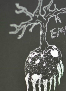 The Tempus Project is a totally new branch of brewery for Beavertown, being mostly barrel aged and using all kinds of funky yeast and mixed fermentation. They wanted to put a new twist on the branding whilst maintaining the signature Beavertown style. The distinctive tree like illustration (which is an icon incorporating the brew process of wood, time and bacteria) is complemented by the lithographic print process and its detail is clearly shown.
“As a brewery known for its considered packaging its nice when people notice we’ve stepped it up further still, and that was absolutely the case with both of these projects” said Nick.
Beavertown’s Dr Jekyll & Mr Hyde gift packs and Tempus Project packs are being sold in most bottle shops and craft beer specialists, as well as being in a number of bars and pubs across the UK. Both the designs and types packaging help continue to set the Beavertown brand apart from others whilst maintaining their distinct brand at the forefront of the industry.
 What can be learned from the Focus Feature:
Good design is all about standing out from the crowd, but what Beavertown proved with this beer is that doesn’t always mean using bright colours or complex artwork. The simple, bold design perfectly matches the mysterious nature of the beer and ultimately grabs your attention.
Taking the time to really think about what makes your beer special and expressing this through the packaging is what good beer design is all about, and advice which all breweries can take on board.
