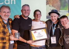
Focus Feature: 360 Degrees Brewing Re-brand, Best Total Concept Design 2017
Our ‘Focus Features’ aim to shine a light on the previous winners of SIBA’s Business Awards in the run up to the launch of the 2018 SIBA Business & Industry Awards on 1st November 2017.
360 Degrees Brewing
Best Total Concept Design 2017
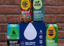
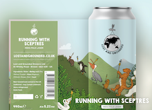
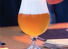
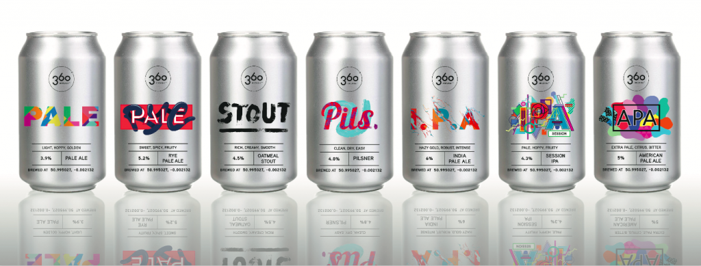
In one of the most hotly contested categories, 360 Degree Brewing were a hit with judges thanks to their clean, clear designs which worked both as distinct individual designs and importantly as an overall brand concept.
Judges commented that 360s eye-ctaching, modern and engaging designs, also work from a practical viewpoint – clearly displaying well-written, concise tasting notes, beer styles and ABVs in a way which complemented rather than detracted from the overal aesthetics of the beer range.
“Great packaging design is about striking the right balance between aesthetics and purpose – something which the 360 designs do perfectly. Not only are they visually appealing, clean and striking in their look, but they really deliver all the right information to the consumer, with the beer style prominently displayed, backed up by simple, to the point tasting notes front and centre. The design is a great example of knowing what the consumer needs to make an informed purchase, and delivering this information in an effective, eye-catching way.” Neil Walker, Business Awards Judging Chair
360 on their original concept and decision to re-brand:
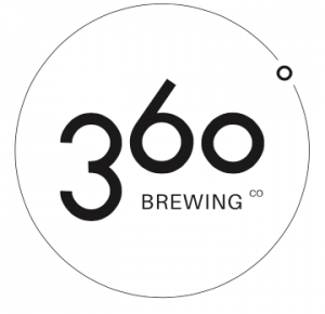 The name 360 is derived from the fact that the business was established, right alongside the Greenwich Meridian in East Sussex, meaning that the business exists at 360 longitude.
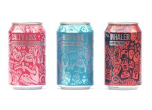
The logo was formed using the same circle to create each number of the 360, as well as the circle the design sits within. The coordinates of the brewery are included at the bottom of each label.
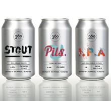
When 360 originally launched in 2013, each beer in the range was given it’s own name. However, as part of the company’s ethos to tell it straight, and not be too clever, we decided to do away with these names and replace them simply with the style of beer. With a unique label design for each beer.
360 on the new designs
Each of the beer labels has been designed to follow the same layout with an emphasis on the style of the beer. Each beer has been created to look very distinct whilst remaining as a part of the collection.
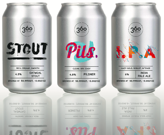
All of the labels have the full logo at the top, followed by the name of the beer with a table of information at the bottom.
The customer is able to identify immediately the style, taste, and ABV percentage, making their decision about which product they should buy, much simpler.
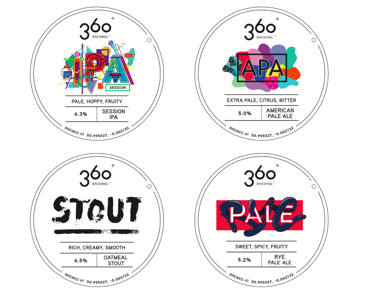
This format is followed throughout the Label designs of both the cans and bottles, as well as, the Clips and badges.
What can be learned from this Focus Feature?
It’s easy to get carried away with beautiful artwork that doesn’t achieve what you set out to do – make the customer buy the beer! What 360 have achieved so well with their design is to perfectly balance the practical function of beer packaging – to convey what it will taste like to consumers – with a modern, eye-catching design.
The beers stand out on the shelf and whilst each has its own identity the range really fits together as an overall design concept, making it a clear winning in this always tough category.
SIBA’s Business Awards 2018 will open for entries on the 1st November 2017. For more information on the categories, or to see a list of previous winners, click here.